Check my CV Get in touch
← All work

Woojer — CRO redesign

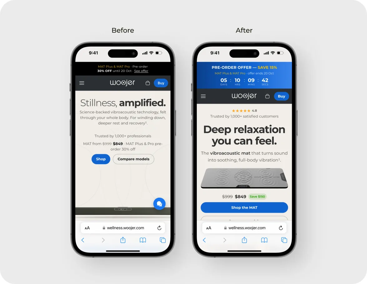
A design assessment from Apexcro: redesign the mobile hero of the Woojer MAT product page for a first-time visitor who knows nothing about the brand.
Woojer — CRO redesign

Overview

Woojer MAT is a vibroacoustic mat that turns sound into full-body vibration for relaxation and recovery. On a phone, the first screen of the product page has to sell an $849 product on its own.

Challenge: the brief asked for a new, more conversion-focused version of the mobile hero. The hero had to explain the product in the first few seconds, make the benefits easy to understand, build trust and give a clear next step.

My role: I did the task on my own: an audit of the current hero, the redesign and a short rationale for every change.

Result: a new mobile hero with an offer timer, a 4.8 rating, a headline that names the benefit, a photo of the mat, a clear price with the saving, a primary button and a money-back guarantee, each change framed as a hypothesis for an A/B test.

Role
UX/UI Designer
Timeline
2026 · test task
Industry
E-commerce
Platform
Mobile web

What was the problem?

Measured against the brief's four goals, the current hero falls short:
1
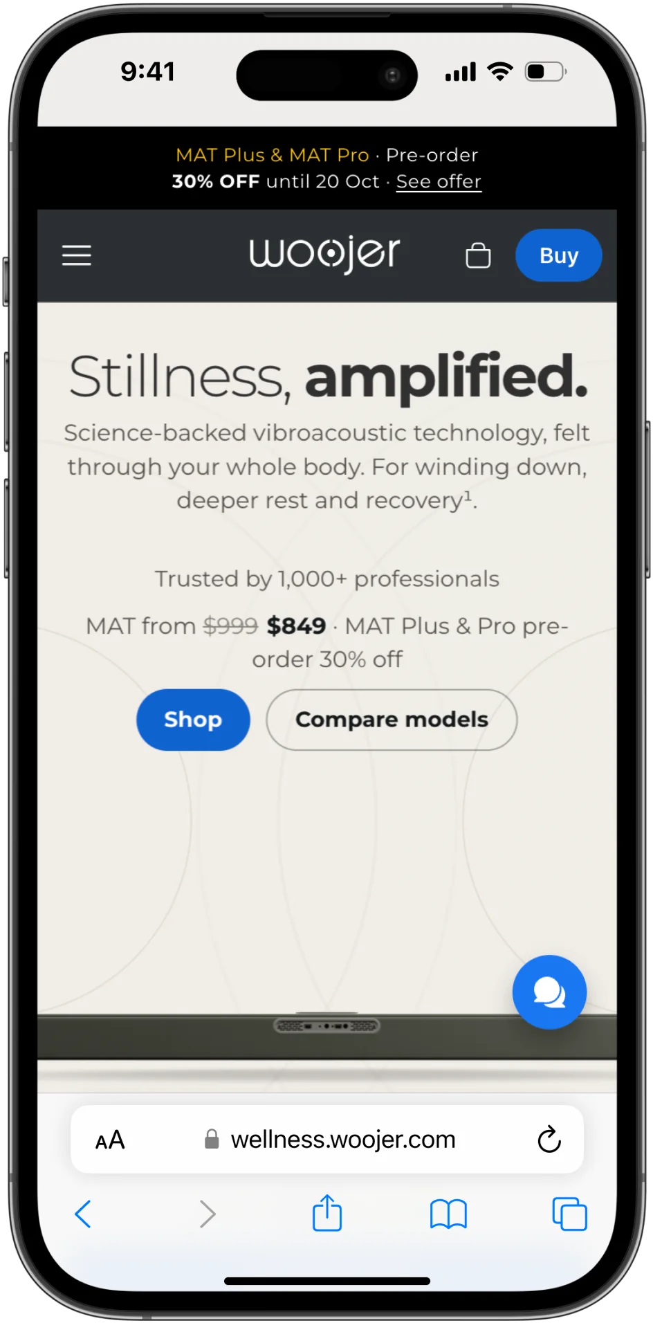
It's unclear what the product is“Stillness, amplified.” sets a mood but doesn't say it's a mat, and only the edge of the mat shows at the bottom of the screen.
2
Benefits are buriedWhat the mat does is described in a paragraph, so the value isn't clear at a glance.
3
The offer is easy to miss30% off sits in a thin black bar at the very top, with no deadline and a small “See offer” link.
4
Little proof up front“Trusted by 1,000+ professionals” is the only trust signal, with no rating or review count.
5
The price hides in a sentence“MAT from $999 $849 · MAT Plus & Pro pre-order 30% off” mixes three offers in one line.
6
No clear next step“Shop” and “Compare models” look the same, so the user has to choose before they're ready.
The original mobile hero.

What did I find out?

I studied the four reference heroes from the brief, IM8, Javvy, Solawave and Heights, and noted what each one shows in the first screen.

Key findings
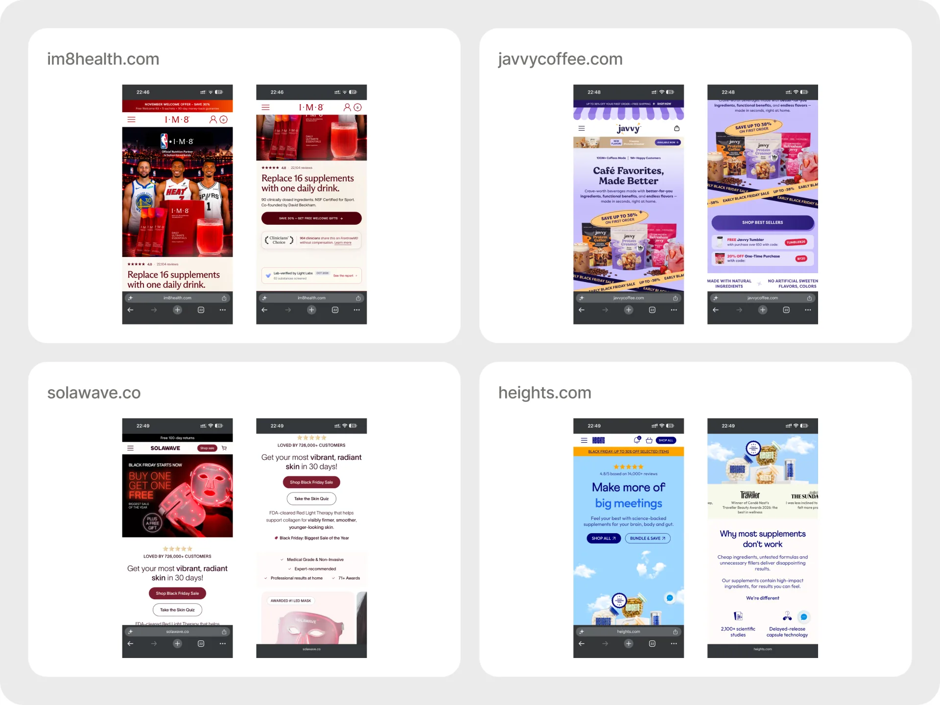
The headline says what you getIM8 opens with “Replace 16 supplements with one daily drink”, Solawave with a concrete result in 30 days.
A rating sits next to the headlineIM8 and Heights both show 4.8 with a review count right in the hero.
The offer is in the button tooIM8's CTA reads “Save 30% + Get Free Welcome Gifts”, so the saving and the action are one step.
Risk reducers are visible earlyIM8 shows a money-back guarantee, Solawave free 100-day returns and a 1-year warranty.
Credentials back the claimsNSF Certified, FDA-cleared and awards prove the technology without a paragraph of copy.
The four reference heroes from the brief, side by side.

What did I expect to change?

Hypothesis 1If the headline names the benefit, the line under it names the product and a photo shows the mat, a first-time visitor understands what it is within seconds.
Hypothesis 2If the offer banner shows a live countdown and the price block shows $999 crossed out, $849 and a “Save $150” badge right above the button, users see exactly what they save and why to buy now.
Hypothesis 3If “Shop the MAT” is the only filled button and “Compare models” becomes secondary, the next step is obvious.
Hypothesis 4If the 30-day money-back guarantee, free shipping and HSA/FSA eligibility sit right under the buttons, buying feels less risky.

Why this solution?

Additional design decisions

Why 4.8 instead of 5.0?A slightly imperfect rating can feel more authentic, provided it reflects genuine customer feedback.
Why show the product?Replacing benefit icons with a mat image helps users immediately recognize what they're buying.
Why keep “Compare models” secondary?I prioritized “Shop the MAT” to create a clear purchase path while keeping product comparison accessible.

How did I solve it?

Offer, trust and the product

  • A blue offer banner replaces the thin black bar: “Save 15%” stands out, and a countdown to 20 Oct shows how long the price lasts
  • A ★ 4.8 rating with “Trusted by 1,000+ satisfied customers” answers “can I trust this?” before the user reads anything else
  • The headline names the benefit, “Deep relaxation you can feel”, the line under it names the product, and a photo shows the mat itself
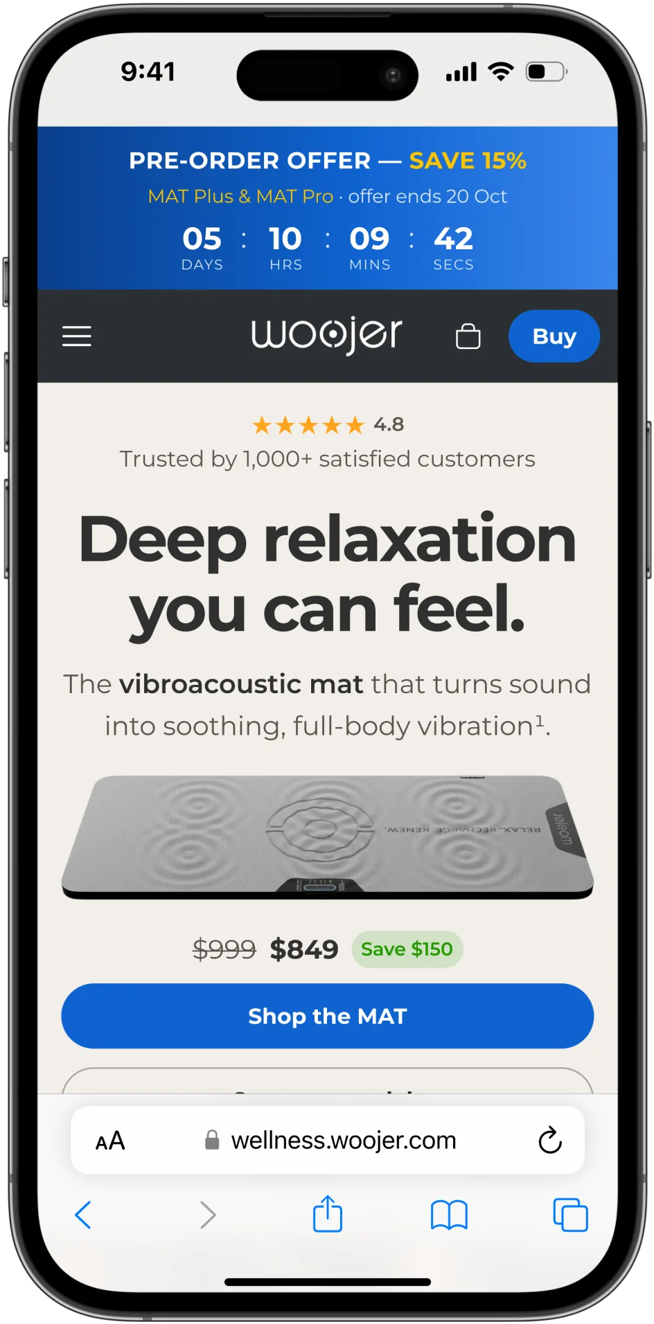
Top of the new hero: offer banner with a timer, rating, headline and the mat.

Price, next step and reassurance

  • The price reads at a glance: $999 crossed out, $849 and a “Save $150” badge
  • “Shop the MAT” is the one filled button; “Compare models” stays as an outlined secondary option
  • The 30-day money-back guarantee, free shipping and HSA/FSA eligibility sit right under the buttons, and a lifestyle photo shows the mat in use
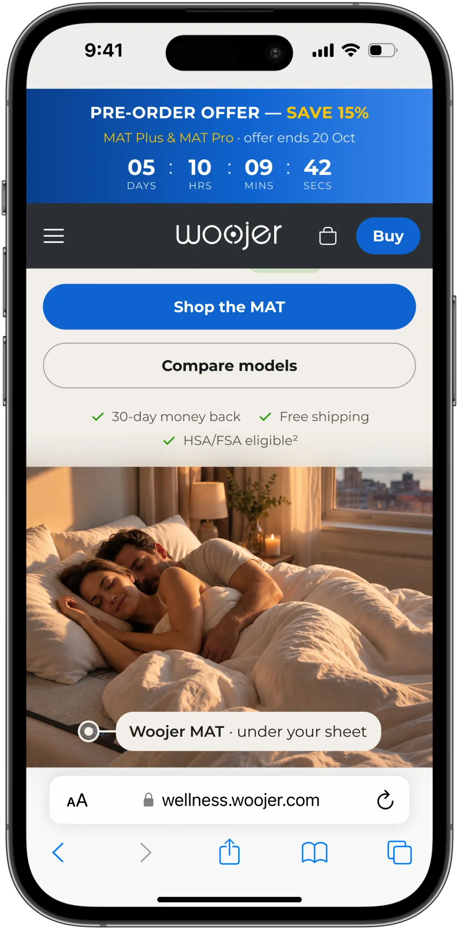
Bottom of the new hero: buttons, reassurance and the lifestyle photo.

Where it stands

4Hypotheses for the first mobile screen, each tied to a goal from the brief
A/BEach change is ready to test against the current hero

This was a test task, so nothing went live. The next step would be an A/B test of the new hero against the current one, watching conversion rate.

Key takeaways

  1. Say what it is first. A first-time visitor needs the product named before the mood.
  2. Put proof and the offer before the headline. A rating and a visible deadline answer “can I trust this?” and “why now?” early.
Other projects