Check my CV Get in touch
← All work

Relatio — offer page redesign

A test task for Relatio, a relationship coaching app: review the offer page users see after the quiz and redesign it to convert better.
Relatio — offer page redesign

Overview

Relatio sells a personal relationship plan. Users take a quiz in a web funnel and then land on the offer page, where they pick a plan and pay.

Challenge: the brief asked for a short competitor review, a backlog of five hypotheses, the three strongest built into the layout, new Before/After visuals and a redesigned plan chart, all explained in a Loom.

My role: I did the whole task on my own: competitor review, hypotheses, the redesign, AI-generated Before/After visuals and a Loom walkthrough of every decision.

Result: a redesigned offer page with all five hypotheses applied (the brief asked for three), a plan roadmap instead of the abstract chart and three pricing variants ready for an A/B test.

Role
UX/UI Designer
Timeline
2026 · test task
Industry
Coaching app
Platform
Mobile web

What was the problem?

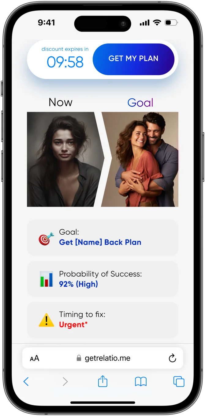
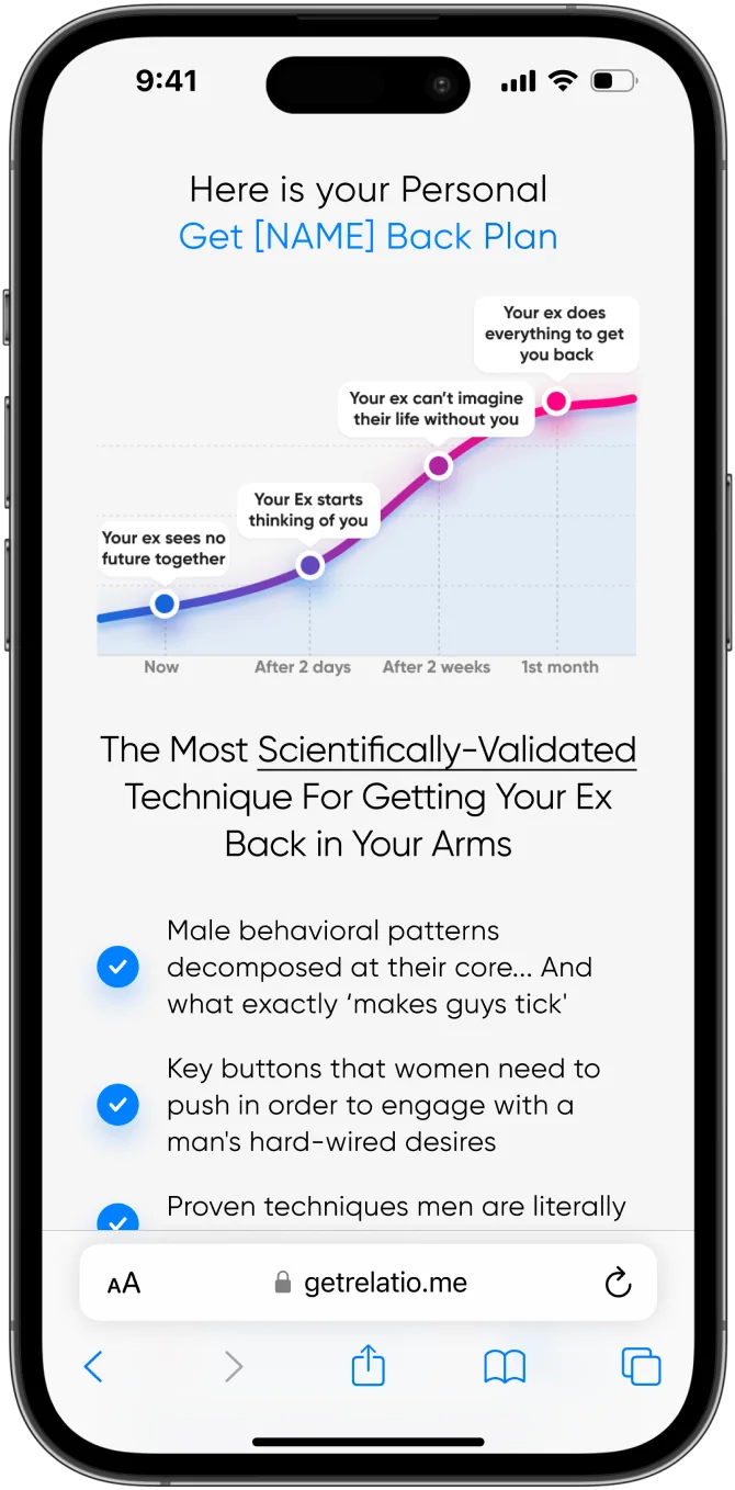
The original page had the right blocks, but users had to do too much work before they could trust it:
1
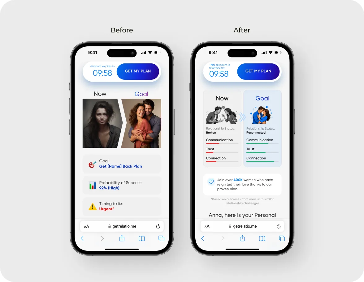
Generic personalizationThe Now/Goal block showed placeholders like [Name] and an abstract “92% probability of success” instead of the user's quiz answers.
2
Hard-to-scan copyThe “Most Scientifically-Validated Technique” block was a uniform wall of text with nothing to catch the eye.
3
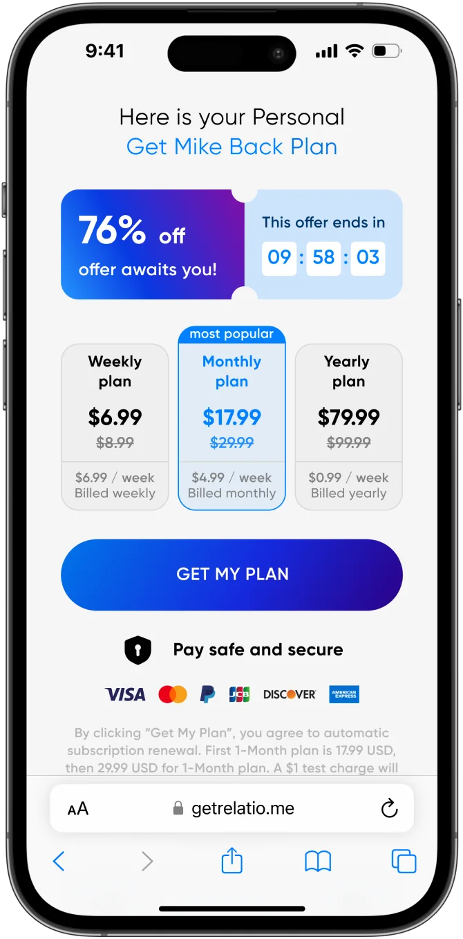
Opaque pricing4-, 12- and 24-week plans showed only a price per day, so users had to work out the real charge themselves.
4
Vague social proof“111 369 5-star rating” had no source and no context, so it was hard to believe.
A generic Now/Goal block
An abstract chart
An abstract chart
Pricing shown only per day

What did I find out?

I reviewed offer pages from four web2app products, MyAddMile, MusesAcademy, Lovon and MuscleMonster, and noted the blocks that push users toward buying.

Key findings
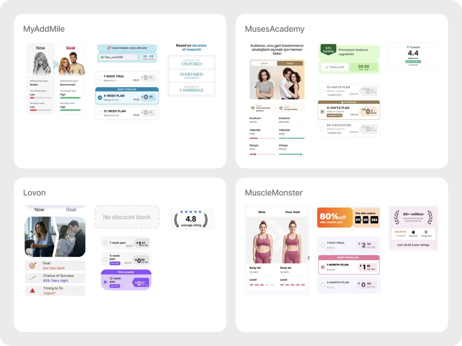
Quiz data sells the planCompetitors pull the user's name, blocker and goal into a Now/Goal comparison, so the paywall feels built for that person.
A one-time offer adds urgencyAn applied discount with a timer gives users who are already interested a reason not to put the decision off.
Familiar plans are easier to compareWeekly, monthly and yearly plans with a savings badge and the full price need less math than a price per day.
Specific proof is more believableA rating tied to the App Store and Google Play, with real review counts, reads as more credible than a big round number.
Four competitor offer pages, broken down into the same blocks: Now/Goal, discount, pricing and trust.

What did I expect to change?

Hypothesis 1If the Before/After block shows the user's own quiz answers (current state, goal, key problems), they'll see their point A and point B and how the plan gets them there.
Hypothesis 2If key phrases in the “Most Scientifically-Validated” block are bold, users who scan rather than read will catch the value faster.
Hypothesis 3If the paywall adds a one-time offer, users who are interested after the quiz get one more reason not to put off the decision.
Hypothesis 4If 4-, 12- and 24-week plans become weekly, monthly and yearly, with a savings badge and the full price, users won't have to calculate the real cost.
Hypothesis 5If the rating shows real numbers and a source, such as 4.8 from 6.4K reviews, users can judge the product by other people's experience.

Why this solution?

Keeping it honest

Why show “After” results as goals?Presenting potential outcomes instead of guaranteed results motivates users while keeping expectations realistic.
Why include a weekly roadmap?A clear roadmap shows what users will work on each week, helping them understand the product's value before purchasing.

How did I solve it?

Personal Before/After and a plan roadmap

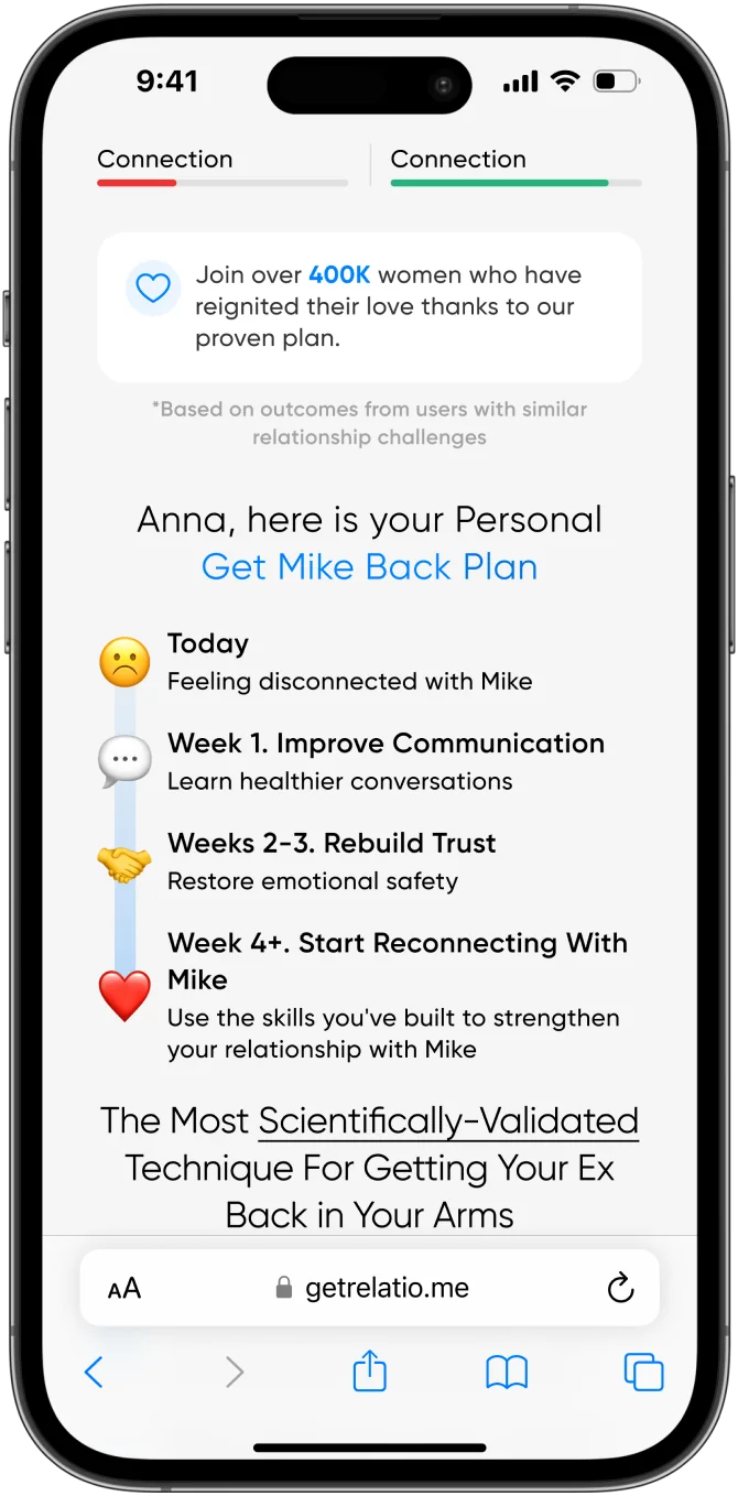
  • Before/After pairs a visual with status bars from the quiz; the shift from red to green shows the gap between now and the goal at a glance
  • The roadmap replaces the abstract chart with a concrete path: Today, Week 1 communication, Weeks 2-3 trust, Week 4+ reconnecting
  • Names from the quiz, Anna and Mike, keep the message consistent from the ad to the quiz to the paywall; I generated the Before/After visuals with AI in the page's style
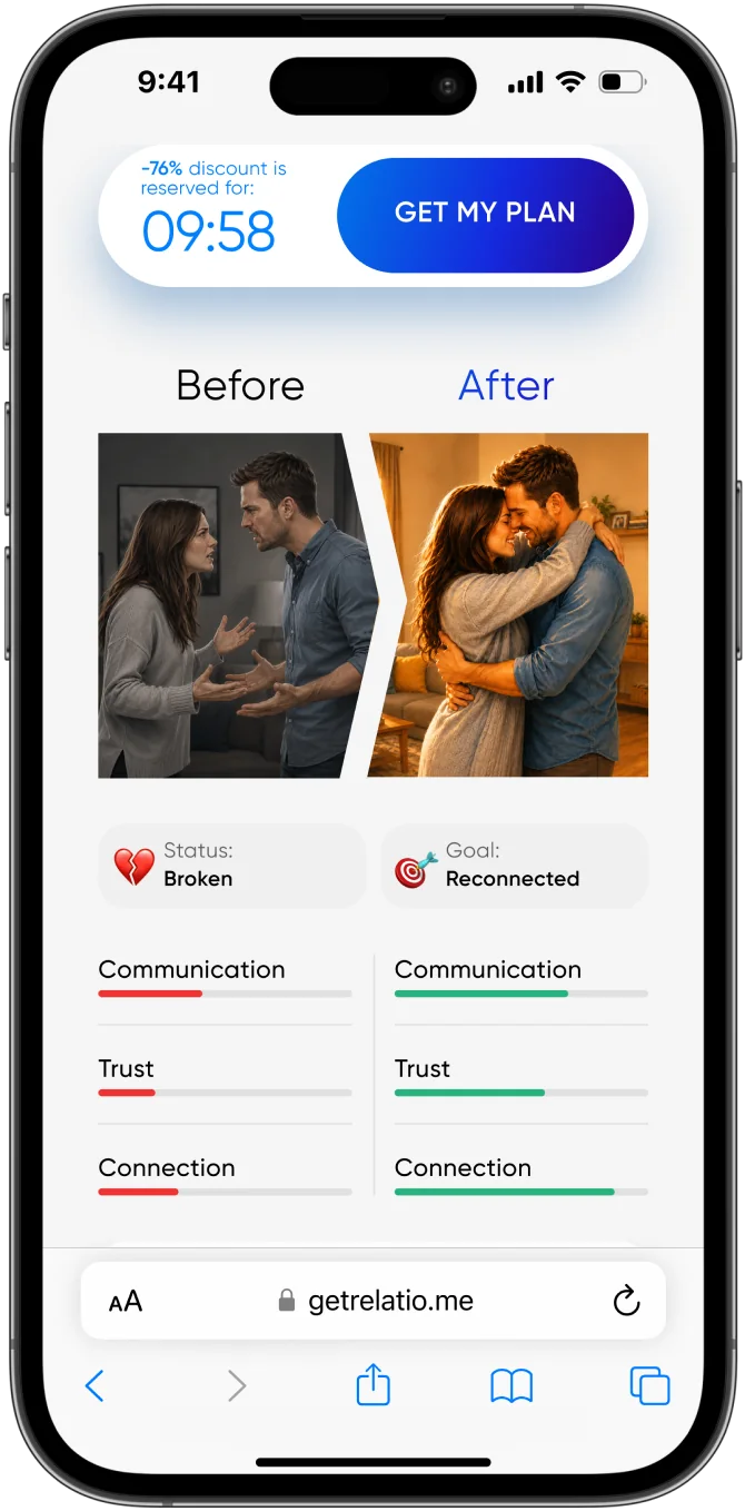
Before/After with quiz data
The roadmap that replaced the chart

Offer, pricing and proof

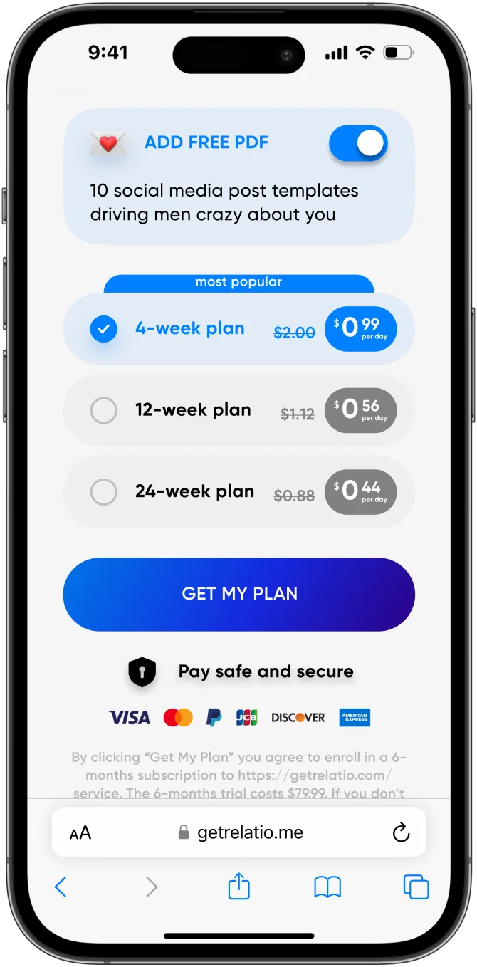
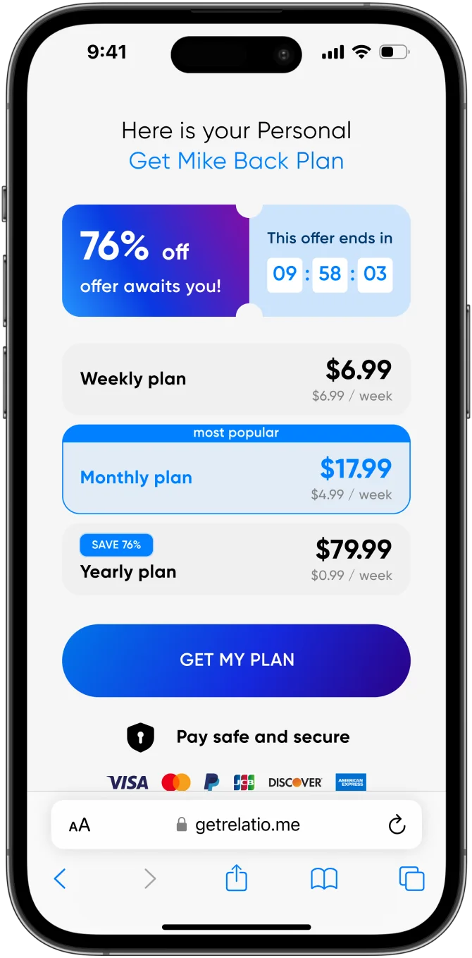
  • An applied promo code, Anna_jun26, with 76% off and a timer, so users don't have to look for a discount
  • Three pricing variants for an A/B test: price per day with a crossed-out anchor, the full charge with a per-week price and a SAVE badge, and the full price with clear billing
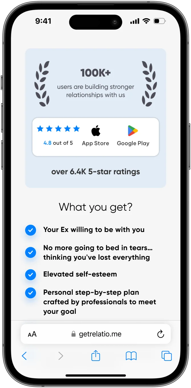
  • The rating block shows 4.8 out of 5, 6.4K reviews and 100K+ users instead of an unexplained number
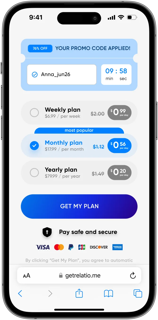
Variant 1: applied promo code, timer and a per-day price with a crossed-out anchor
Plus the rating block
Variant 2: the full charge first, per-week price and a SAVE badge.
Variant 3: full price with clear weekly, monthly or yearly billing.

Where it stands

5Hypotheses, all applied in the final layout
3Pricing variants ready for an A/B test

This was a test task, so nothing went live. If the page shipped, I'd A/B test the pricing variants first and watch conversion and refund rates.

Key takeaways

  1. Quiz data is the cheapest personalization. The user has already told you their name, problem and goal, so the paywall should use them.
  2. Honest framing matters on a paywall. Goal-style After bars and real review counts build trust without setting up refunds.
  3. Next. Test the three pricing variants against each other before changing anything else.
Other projects